Decor Inspirations: Scandi
Although my favourite style right now is Japandi, the origin of this style is Scandinavian. IKEA is the best example of this design style, and there is a reason people are drawn to clean lines, warm textiles and cozy accents.
I have a Finnish sister-in-law and although she cringes at IKEA furniture, I think her style leans towards Scandinavian: minimalist, clean lines, creative but sophisticated shapes and neutral tones.
Here are a five things that I use when planning around Scandinavian Design and how you can apply it to your space easily without needing to invest too much, and using what you already may have":
Clutter-less Space
Part of what makes all these designs so pleasing to the eye and calming is the lack of stuff. If you are a collector of items, or enjoy having things everywhere (or just have a lot of stuff which is my problem), this is sometimes hard to do. The key here is storage solutions that allow you to put away a lot of your things and only bring out the decor that matches your theme. open shelving with tasteful decor works here, but not covering every surface.
White and Bright
Every time I get into a space that I can paint, I paint it white. White is such a great backdrop for everything else and it alongside similar light neutrals are a staple here. White or light neutrals instantly make a space feel brighter and bigger, and Scandi spaces do best when they feel light and uncluttered. A great way to do this after painting a space a lighter colour is to also add white airy curtains (hung as high as possible!), which lets in lovely diffused white light.
Natural Elements and Shapes
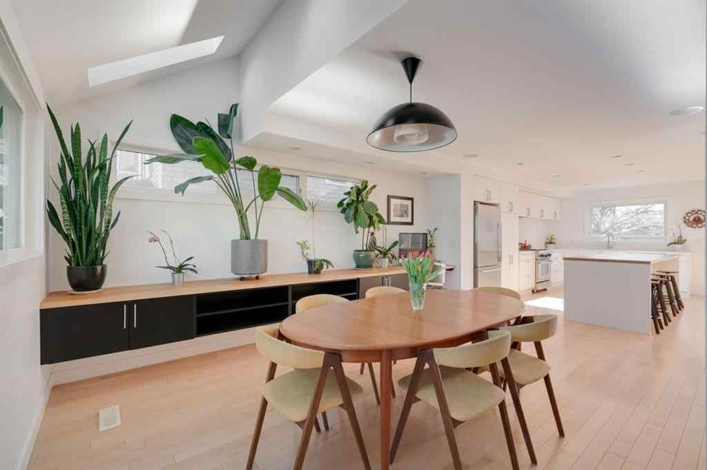
I used to think of myself as only loving clean, crisp, whites, and that wood tones were a no. This shiny white desks and bookshelves and similar styled dressers. I’ve gone through iterations of my style that add wood tones, but Scandi style is based on minimal, earth tones, and natural colours. Light wood, especially on your floors, is on trend here. The grey wood planks (which I have right now too), and more neutral oak flooring is consistent here. Natural fibers via your couch, pillows, throw blankets incorporate texture without introducing crazy colours. Read: texture.
Cozy up
Like I mentioned above, lots of natural texture in the form of blankets and pillows on seating spaces are important here. I did a series on Hygge, and I draw a lot from that inspo into this style. Neutral Shag Rug, many different textured neutral throws, linen pillows on the couch.
Greenery
Bringing the outside in is important here. You can do this in the form of bare branches and wood, but the best way to do this is incorporating plants. I now treat greenery as another neutral, and a great way to add colour without actually adding colour. I find it a great accent for a shared living space that feels not too feminine and not too masculine. Another way to bring the outside in is nice big windows and treating your outside view as art.
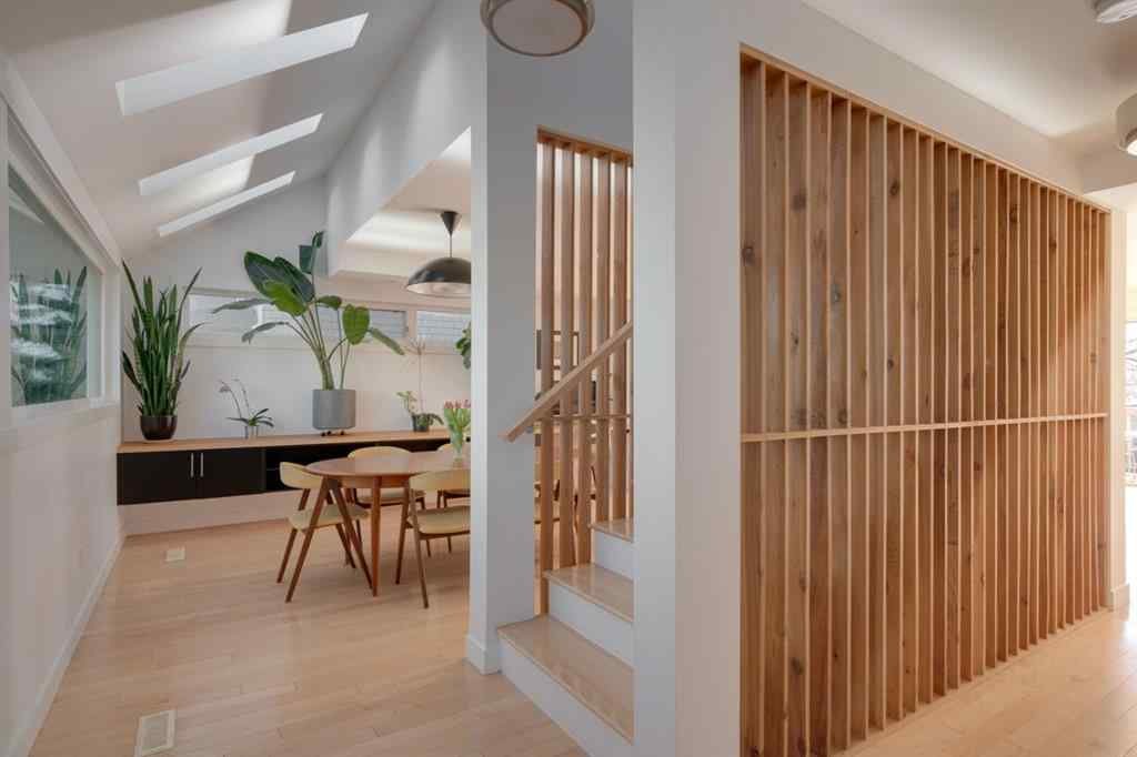
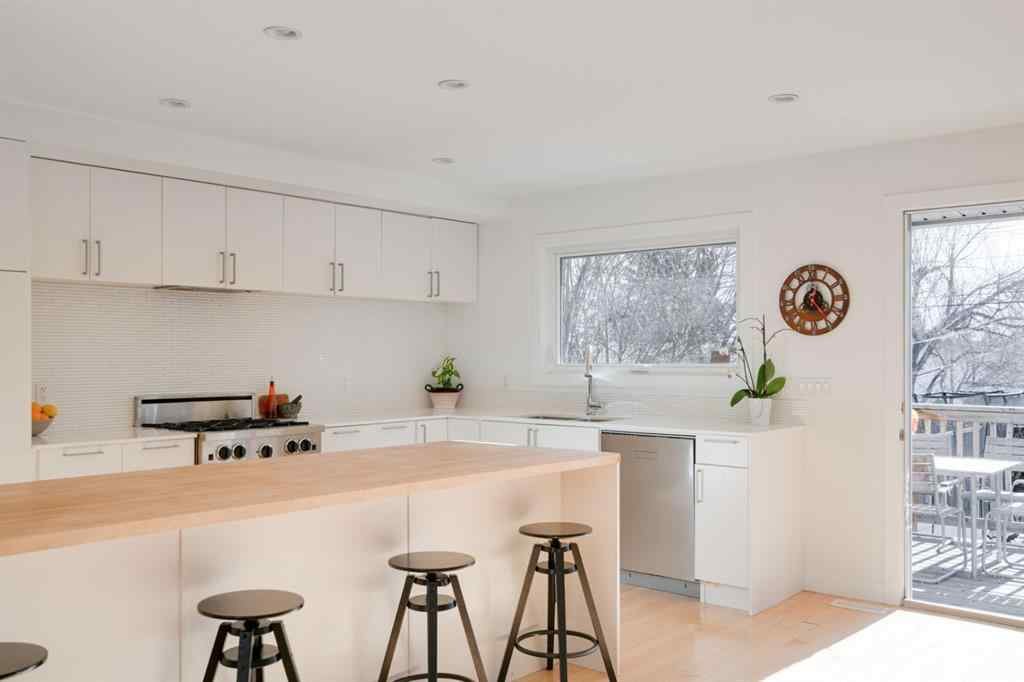
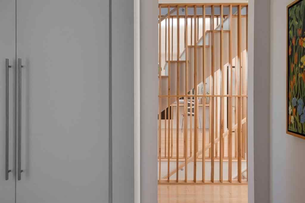
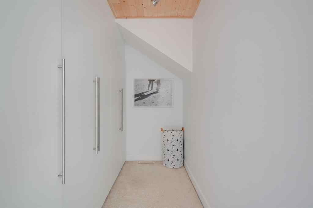
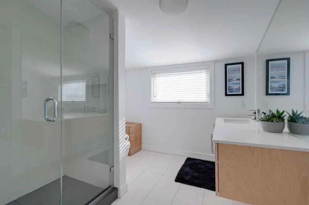
Here is a mood board I put together for a client that incorporated Bohemian, Scandi and a bit of Japandi. Below are some snaps from a beautiful Scandinavian inspired home that was for sale in the local market:
How have you incorporated Scandi into your current home design?
Love, E


